Click the HTML icon in the toolbar above to edit spacer height.
TO EDIT: Change the class="spacer-3" to any number between 0 (none) and 5 (most) to resize a spacer. Ex. class="spacer-5"
Vertical spacers are responsive and 50% smaller on mobile than on tablet+.

あなたの空間をノミネート

当社は、お客様がMatterportの3Dデジタルツインの世界をお楽しみいただいるのを嬉しく思います。こちらの空間をお選びになった理由や空間をキャプチャしたストーリーをお聞かせください。頂戴したストーリーは、Matterportデジタルギャラリーあるいはソーシャルチャンネルでご紹介させていただきます。InstagramやFacebook等のSNSで、ぜひ #MatterportYourSpace でタグ付けくださいませ!


まだ、ノミネートされていない方は、 無料ですので、ぜひ、お手持ちのiPhoneまたはiPadからノミネートしてみてください

Click the HTML icon in the toolbar above to edit spacer height.
TO EDIT: Change the class="spacer-3" to any number between 0 (none) and 5 (most) to resize a spacer. Ex. class="spacer-5"
Vertical spacers are responsive and 50% smaller on mobile than on tablet+.
Click the HTML icon in the toolbar above to edit spacer height.
TO EDIT: Change the class="spacer-3" to any number between 0 (none) and 5 (most) to resize a spacer. Ex. class="spacer-5"
Vertical spacers are responsive and 50% smaller on mobile than on tablet+.

全ての人のための3Dキャプチャー

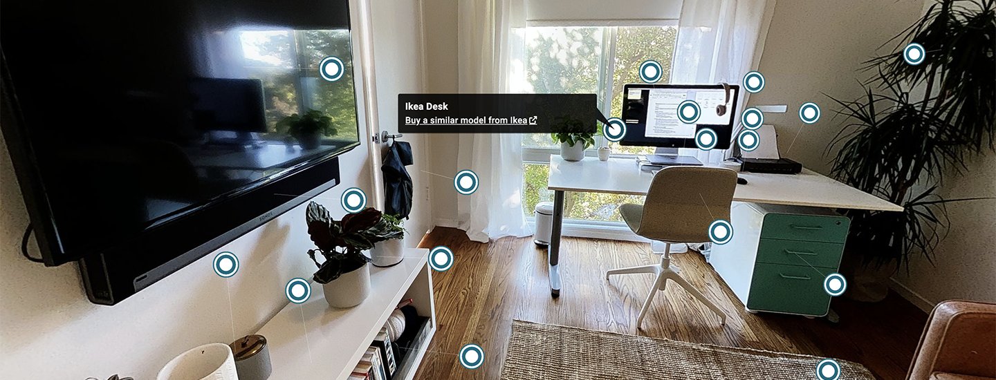
iPhoneXでキャプチャーされたハイテク機器などが置かれている快適なホームオフィスを覗いてみましょう!

Click the HTML icon in the toolbar above to edit spacer height.
TO EDIT: Change the class="spacer-3" to any number between 0 (none) and 5 (most) to resize a spacer. Ex. class="spacer-5"
Vertical spacers are responsive and 50% smaller on mobile than on tablet+.
Click the HTML icon in the toolbar above to edit spacer height.
TO EDIT: Change the class="spacer-3" to any number between 0 (none) and 5 (most) to resize a spacer. Ex. class="spacer-5"
Vertical spacers are responsive and 50% smaller on mobile than on tablet+.
Block 1
editable text
Block 2
editable text
grows to fill column
Block 3
editable text
grows to fill column
Block 4
editable text
Block 1
editable text
Block 2
editable text
grows to fill column
Block 3
editable text
grows to fill column
Block 4
editable text