Click the HTML icon in the toolbar above to edit spacer height.
TO EDIT: Change the class="spacer-3" to any number between 0 (none) and 5 (most) to resize a spacer. Ex. class="spacer-5"
Vertical spacers are responsive and 50% smaller on mobile than on tablet+.

여러분의 공간을 추천하세요

저희는 수많은 고객분들께서 Matterport로 캡처한 3D 디지털 트윈을 통해 무엇을 하시는지 매우 기대하고 있습니다. 여러분의 공간에 얽힌 이야기를 들려주시면 저희 디지털 갤러리나 소셜 채널에 출연하실 수 있습니다. 소셜미디어에 공유하시려면, #MatterportYourSpace를 테그하세요.

아직 시도해보지 않으셨다면, 아이폰이나 아이패드로를 이용해서 무료로 시작하실 수 있습니다.

Click the HTML icon in the toolbar above to edit spacer height.
TO EDIT: Change the class="spacer-3" to any number between 0 (none) and 5 (most) to resize a spacer. Ex. class="spacer-5"
Vertical spacers are responsive and 50% smaller on mobile than on tablet+.
Click the HTML icon in the toolbar above to edit spacer height.
TO EDIT: Change the class="spacer-3" to any number between 0 (none) and 5 (most) to resize a spacer. Ex. class="spacer-5"
Vertical spacers are responsive and 50% smaller on mobile than on tablet+.

모든 것을 3D캡쳐하세요

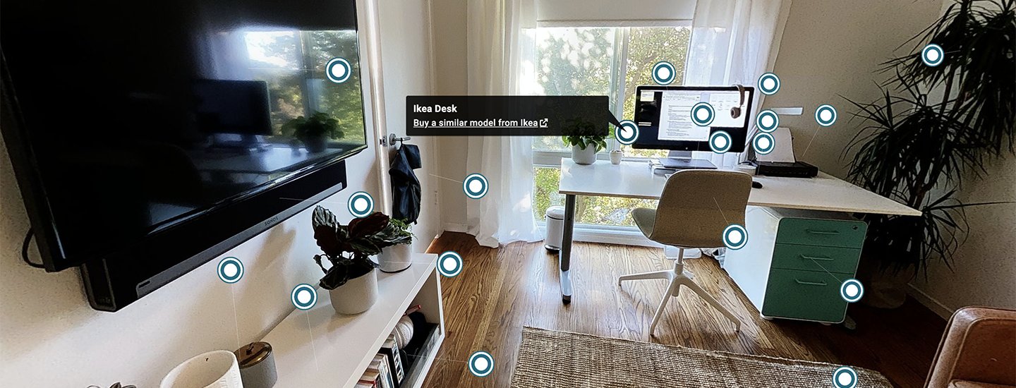
특별한 물건들과 멋진 기술, 기기들로 가득 찬 창의적인 홈 오피스를 들여다보세요. 여러 iPhone 기종으로 캡처할 수 있습니다.

Click the HTML icon in the toolbar above to edit spacer height.
TO EDIT: Change the class="spacer-3" to any number between 0 (none) and 5 (most) to resize a spacer. Ex. class="spacer-5"
Vertical spacers are responsive and 50% smaller on mobile than on tablet+.
Click the HTML icon in the toolbar above to edit spacer height.
TO EDIT: Change the class="spacer-3" to any number between 0 (none) and 5 (most) to resize a spacer. Ex. class="spacer-5"
Vertical spacers are responsive and 50% smaller on mobile than on tablet+.
Block 1
editable text
Block 2
editable text
grows to fill column
Block 3
editable text
grows to fill column
Block 4
editable text
Block 1
editable text
Block 2
editable text
grows to fill column
Block 3
editable text
grows to fill column
Block 4
editable text