VRBlack.png
Click the HTML icon in the toolbar above to edit spacer height.
TO EDIT: Change the class="spacer-3" to any number between 0 (none) and 5 (most) to resize a spacer. Ex. class="spacer-5"
Vertical spacers are responsive and 50% smaller on mobile than on tablet+.

Explore Matterport Spaces in VR

Explore real-world places in immersive virtual reality right from your own home!


Click the HTML icon in the toolbar above to edit spacer height.
TO EDIT: Change the class="spacer-3" to any number between 0 (none) and 5 (most) to resize a spacer. Ex. class="spacer-5"
Vertical spacers are responsive and 50% smaller on mobile than on tablet+.
Click the HTML icon in the toolbar above to edit spacer height.
TO EDIT: Change the class="spacer-3" to any number between 0 (none) and 5 (most) to resize a spacer. Ex. class="spacer-5"
Vertical spacers are responsive and 50% smaller on mobile than on tablet+.

Getting Started


enter_vr_4.jpg

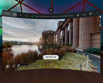
All the content streams through your web browser, so there’s no need to download an extra app. Just open a space in your Oculus browser, and hit the ENTER VR button.

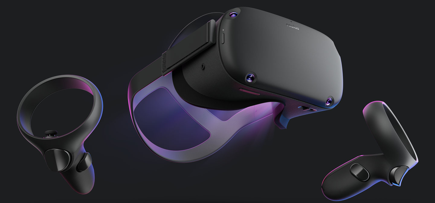
To view Matterport Spaces in VR, you can use:

Click the HTML icon in the toolbar above to edit spacer height.
TO EDIT: Change the class="spacer-3" to any number between 0 (none) and 5 (most) to resize a spacer. Ex. class="spacer-5"
Vertical spacers are responsive and 50% smaller on mobile than on tablet+.
Click the HTML icon in the toolbar above to edit spacer height.
TO EDIT: Change the class="spacer-3" to any number between 0 (none) and 5 (most) to resize a spacer. Ex. class="spacer-5"
Vertical spacers are responsive and 50% smaller on mobile than on tablet+.

Try it for Yourself


MP_RealEstate_3 200x180.jpeg

Matterport powers the largest library of real world places in virtual reality. Put on a VR headset, and explore museums, castles, monuments, beautiful homes and other exciting destinations, just as if you're there.

Click the HTML icon in the toolbar above to edit spacer height.
TO EDIT: Change the class="spacer-3" to any number between 0 (none) and 5 (most) to resize a spacer. Ex. class="spacer-5"
Vertical spacers are responsive and 50% smaller on mobile than on tablet+.
Click the HTML icon in the toolbar above to edit spacer height.
TO EDIT: Change the class="spacer-3" to any number between 0 (none) and 5 (most) to resize a spacer. Ex. class="spacer-5"
Vertical spacers are responsive and 50% smaller on mobile than on tablet+.
Click the HTML icon in the toolbar above to edit spacer height.
TO EDIT: Change the class="spacer-3" to any number between 0 (none) and 5 (most) to resize a spacer. Ex. class="spacer-5"
Vertical spacers are responsive and 50% smaller on mobile than on tablet+.

Create your own VR Spaces


iPhones-transparent.png

Now anyone can create 3D content for VR. 

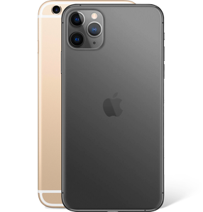
Matterport for iPhone makes it quick and easy to capture a real world place. Our powerful cloud processing converts what you’ve captured into a 3D space fully explorable in virtual reality. 
Learn more about Matterport for iPhone

Already a Matterport customer? Use Matterport for iPhone today

  • Your audience can take full advantage of Matterport and VR without ever leaving your website. Keep your customers fully engaged with your brand and give them an amazing, immersive digital experience.
Click the HTML icon in the toolbar above to edit spacer height.
TO EDIT: Change the class="spacer-3" to any number between 0 (none) and 5 (most) to resize a spacer. Ex. class="spacer-5"
Vertical spacers are responsive and 50% smaller on mobile than on tablet+.
Click the HTML icon in the toolbar above to edit spacer height.
TO EDIT: Change the class="spacer-3" to any number between 0 (none) and 5 (most) to resize a spacer. Ex. class="spacer-5"
Vertical spacers are responsive and 50% smaller on mobile than on tablet+.

You'll be in good company

See how our partners are using VR

Sothebys.png
HomeVisit.png
Lodgis.png 
Click the HTML icon in the toolbar above to edit spacer height.
TO EDIT: Change the class="spacer-3" to any number between 0 (none) and 5 (most) to resize a spacer. Ex. class="spacer-5"
Vertical spacers are responsive and 50% smaller on mobile than on tablet+.
Block 1
editable text
Block 3
editable text
grows to fill column
Block 4
editable text
Block 1
editable text
Block 2
editable text
grows to fill column
Block 3
editable text
grows to fill column
Block 4
editable text